Some homes are designed to convey a sense of drama. Others are built for coziness. When Jan and Chris Marshall decided to renovate their 20-year-old Kings Grant home following flood damage, they created a space that’s both strikingly beautiful and peaceful.
“We came home from a weekend away in 2015 to find our ground floor covered in mud from the flood,” she recalls. “Linda Burnside called and said that she could help us figure out the best plan of attack for getting whatever work done we needed.
“To us, it was a huge gift, and she was a tremendous blessing,” Jan continues. “We couldn’t have done it without her. You just don’t realize how much stuff you have around until the clutter is gone and everything feels so calm. It’s such a wonderful feeling to walk into the house and see clear counters and open spaces!”
The Blueprint
Creating that ambience, though, took more than tossing out knickknacks. Working with LGB Interiors, Jan and Chris began by changing the layout of the kitchen, rear foyer and den, transforming three separate but connecting rooms into a large living space that flows from one end of the house to the other and offers easy access and beautiful views of the back yard and brick patio. “The side door used to open into a rear entry hall that had sliding glass doors on either side,” explains Jan. “It was pretty, but the doors made it feel like a small room that we couldn’t use for anything. Now that those doors are gone, it’s like a different house!”
Removing the glass doors also allowed the Marshalls to move the wet bar from its original location near the door to the garage to the new center area between the kitchen and the den. Not only is the bar in a more convenient location, the family was also able to install a new ice machine that produces the crushed ice that the Marshall children adore. “The children had two requests, and one of them was for an ice machine that makes crushed ice instead of cubes,” Jan says with a laugh. Best of all, the new space also had enough room for a cabinet where Jan now displays part of her collection of china, particularly a treasured gold and white set given to her by a dear friend. “It gives me joy every time I see it,” she says.
The reconfiguration offered another bonus as well: an increase in storage space in the form of a large pantry that could accommodate food, serving pieces, cookbooks, party glasses, vases, a phone and device charging station and a range of small appliances. “We even put the coffee maker in there,” says Jan. “It’s so nice to have everything out of sight!”
With the layout nailed down, Jan and Linda tackled the details of the kitchen, tweaking the placement of appliances and creating a large custom island brimming with creative storage options. On one side, deep drawers make it easy to grab pots, pans and other kitchen essentials without digging into the dark recesses of a cupboard; on the other, narrow cabinets hold a single row of items. There’s even a microwave built in.
What the island doesn’t have is a sink. Jan says that she thought about it, but, in the end, she just didn’t want to break up the workspace. They even got creative with the placement of the refrigerator and freezer, installing two separate, equally-sized units along one wall with a small counter in between. “They could have been placed side-by-side, but this seemed to make more sense,” says Jan. “Having the counter in the middle instead of beside just one unit is much more convenient.”
The Details
As walls were being moved, floors redone and counters constructed, Jan and Linda were hard at work creating a decorating plan that would make the most of the new, open design. “Since the spaces are connected, the same feeling needs to read all the way through,” says Linda. “The fun part is making sure there’s something interesting to look at no matter where you’re standing or sitting.”
They decided on a color scheme of pale blues and grays, which would enhance the airiness of the space and provide the Zen-like vibe the family wanted. Furnishings would be structured but comfortable. “Jan and I went to High Point, North Carolina together to shop for furniture, and the design really evolved while we were there,” says Linda. “We wanted calm, but we also wanted touches of drama that were fabulous and interesting but not overpowering.”
In the end, it was the sofa that got the ball rolling, specifically an oversized ice blue sectional covered in matelassé-like fabric printed with a subtle watermarked pattern. “Besides the ice machine, the other request my children had was for a sectional sofa,” explains Jan. “Even though they’re both older, we still love to gather as a family on one sofa and watch movies. A sectional gives us plenty of room for everyone.” She was also thrilled to be able to invest in a piece of furniture covered in pale fabric. “I never could have had a sofa this color when my children were small as we never knew what was going to spill next,” she says with a laugh. “It’s wonderful to have all these new choices!”
To complement the sectional, Jan and Linda decided on a pair of swivel rocking chairs upholstered in a soft tie-dyed pattern. A third armchair echoes the shape of the swivel rockers but is covered in a textured blue solid. “Texture is one of the things that makes a room interesting,” says Linda. “Even if you’ve done a great job with patterns, if everything is smooth or nubby or shiny it becomes boring.”
There’s nothing boring about the Marshalls’ den. Dark wood floors add depth, as do a pair of rugs stacked on top of each other, one an oatmeal-colored sisal, the other a contemporary blue and tan Oriental. “Color isn’t the only thing that has changed in design since the late 1990s,” says Linda. “Back then, the pattern would have been in the drapes, and the rug would have been either a solid color or a dark Oriental. This feels modern.”

Throughout the room, artistic details stand out. A 12-sided globe works as a small side table; flower-filled vases add small splashes of color; a variety of lamps and throw pillows in various shades and fabrics give finished polish to the room. Houseplants — an old-is-new trend — are tucked into corners and perched on tabletops, always in pretty containers. The built-in shelves are so artfully arranged that they resemble department store display windows during the holiday season.
“The key to interesting, well-designed bookshelves is to mix things up, but not too much,” Linda says. “I always remove a few shelves so I have varying spaces to work with. That way, you can throw in a few tall objects or big pieces of art. I put a spiky mirror in Jan and Chris’ shelves, and I like the way it turned out. Books should be stacked or propped, but the colors matter. And if you’re going to display family photographs, be sure the frames match or somehow tell a story. All those random frames can look jumbled.”
In the adjacent area that leads to the kitchen, the wet bar is dressed for company with a hammered nickel sink that forms an oversized vessel; across the hall, a bleached-wood credenza fills a wall without disturbing the sweeping view. The color of both the credenza and the frame surrounding the mirror that hangs above it is so close to that of the surrounding walls that the texture of both pieces is evident. Instead of being hung, framed drawings are propped against each other and against the wall. “Layering artwork like this is a great trend to try because it’s inexpensive and not permanent,” says Linda.


Like a tiny jewel box, the powder room, with its oversized glittery pulls, deep charcoal wallpaper in a stylized lattice print, bottle-glass sink and honed marble counter, seems to glow.
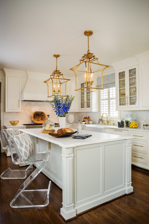
Entering the kitchen is like walking into a spa, albeit one with appliances. Tucked into an alcove, the breakfast room is cozy and inviting; the dramatic acrylic painting that dominates the wall adds color and motion to the space without overwhelming the rest of the area. Grounded by the dark wood floors, the island, with its uninterrupted expanse of honed marble, resembles a sculpture.
The light fixtures, open Japanese lanterns in antique satin brass, are large but seem to float quietly over the scene. They match the sleek drawer pulls, narrow cylinders of satin brass that are both warm and modern. There are a few decorative pieces on the counters — a rough-hewn wooden tray, glass jars filled with fruit, a collection of ceramic bowls, but there’s no clutter. Even the electrical outlets are hidden, tucked underneath the bottoms of the cupboards. “It’s all about less now,” says Linda. “A few things here and there instead of big collections. Everything is streamlined.”


